One fan put it perfectly in a comment on The Name Chapter: TEMPTATION logo video that was released on December 15: “Only TOMORROW X TOGETHER could announce their comeback like this.” An animated logo is always one of the first reveals in the lead-up to their comeback. For every album, the group unveils a variation on their logo that functions as a hint toward the meaning behind the upcoming release. Unlike for previous albums, the undulating TEMPTATION logo represents a young man swayed by temptation.
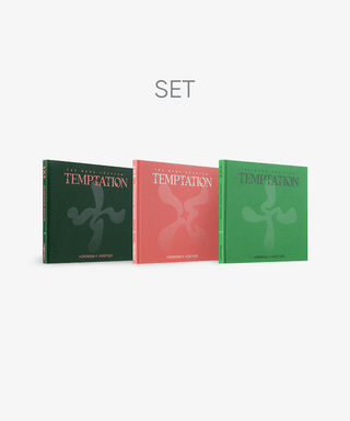
Choi SeaYol, who works in the BX2 department behind TOMORROW X TOGETHER’s artist and album branding, went with a shade of green for the TEMPTATION background. He thought of it as a color that “has a sense of youth like a seedling, weakness, purity and yet peculiar like poison or liquor—and something somehow dark about it.” After losing everything, even love, in minisode 2: Thursday’s Child, their previous release, TOMORROW X TOGETHER is on the brink of being cut off from the world completely. In The Name Chapter: TEMPTATION, they shift their focus from their relationship with others and onto themselves. Unlike The Chaos Chapter: FIGHT OR ESCAPE days, when there was a clear choice to make, they now find themselves facing a world where it’s impossible to even differentiate good from bad. You can hear it in the way YEONJUN’s voice is warped in the logo video when he says the line, “It’s so sweet. But I should find my name.” They’re no longer waiting for someone to rescue them from this world; now they have to steel themselves against temptation without any help. “We’re focusing our efforts on making sure the TOMORROW X TOGETHER logo conveys what the artist is currently going through that’s allowing them to grow,” Choi explains, “and a bit of what they’re likely to face in the future.”
The Dream Chapter, TOMORROW X TOGETHER’s first album series, begins with The Dream Chapter: STAR, the animated logo for which is two geometric shapes, identical except for their colors, that move toward each other and then overlap. This reflects “a narrative about trying to figure out your own identity within the bigger group picture of being with your peers,” Choi says. Kim Yeeun, another member of the BX2 department, says the albums are meant to reflect each step of growing up as TOMORROW X TOGETHER’s peer group experiences it. “TOMORROW X TOGETHER’s story is all about growth, and it follows the same trajectory as other young people, reflecting them as a persona,” she says, “so the logo grows along with the narrative just as the artists do.” Choi adds that, “within this process of growth,” the logo videos for The Dream Chapter series show “the vulnerability of childhood and a sense of what it means to be a young boy,” while those for The Chaos Chapter series show “figuring out how to break free of the chains of chaos after meeting someone new.” The logo for The Dream Chapter: MAGIC changes into a sparkle representing places and times that are almost magical, reflecting lyrics like, “We gotta be together to get to the hidden 9 ¾,” from the lead single “9 and Three Quarters (Run Away).” But the brief flicker of that sparkle can’t last forever. In MAGIC’s animated logo, the two shapes come together to form an X and a plus sign; for The Dream Chapter: ETERNITY, the green X becomes a circle, splitting out into separate green and purple rings. That brief moment from before is over and the cracks start to show, showing that, paradoxically, ETERNITY is anything but. That’s when the boys’ fantasies of eternal friendship are shattered and The Chaos Chapter begins. And that’s why, in the FREEZE logo video, the letters “TXT” are trapped in place by chaos outside their control and even the sounds in the video sound like something frozen. The only thing moving is the beating heart right in the middle. Isolated and cut off from others, the boys enter a period of life where they experience the kind of love that makes your heart race even amidst chaos. Now that they’ve met this “one and only,” the design inside the X in The Chaos Chapter: FIGHT OR ESCAPE logo becomes more pointed and stronger, and the same change is seen in the boys, who want to smash through the frozen world and escape one way or another. “The animated logos for The Chaos Chapter series capture how this generation responds when faced with certain chaotic situations,” Choi says. “First they freeze, then they have to choose whether to fight or escape.” Altogether, this acts as a metaphor for the fears TOMORROW X TOGETHER and the generation they represent have no choice but to face and how they choose to confront them.
As the shattered heart in the Thursday’s Child logo suggests, TOMORROW X TOGETHER gets their hearts broken. The album also “shows the ‘good boy’ group of the K-pop scene has ‘gone bad,’” Kim says—a stark contrast with what had been their signature zestful image. TOMORROW X TOGETHER’s main lineup of albums, the Chapter series, shows how they grow over time, shifting their focus from being a part of their peer group, to becoming one side of a couple, to discovering their true identity. By contrast, the minisode series reflects the realities they face, such as the opportunity for dramatic change they find in Thursday’s Child. The minisode 1: Blue Hour logo animation reflects the shift to virtual reality that took place during the pandemic through the use of pixel art to conjure up images of a game world. For the minisode 2: Thursday’s Child logo, brush- and pen-drawn X cover up a broken heart, suggesting a reality so broken that, like shattered glass, it can never be put back together. “We made the boys expressing the emotions they feel after experiencing first love and their first breakup in The Chaos Chapter the main focus,” Choi says. The logo shows emotional chaos—endlessly angry yet sad one day, then infinitely empty the next. The animated logos reflect how the Chapter series tells the major events of the boys’ life story while the minisode series gives a detailed account of the things that happen when reality steps in and causes their lives to change.
“The logos are a strong asset for TOMORROW X TOGETHER’s branding and serve as their identity,” Kim says of the animated logos. “They follow the artist’s narrative and serve to summarize the way they’re growing.” Each animated logo reminds listeners what the group was like during the corresponding period and the logos are as diverse and ever-changing as the group themselves have proven to be since they debuted back in 2019. You can tell how big that change has been just by watching the animated logos for The Dream Chapter: STAR and The Name Chapter: TEMPTATION back to back. Throughout that time, the members of TOMORROW X TOGETHER have passed through all the same stages of growth that everyone in their generation has gone through to arrive at where they are today. Youth is, after all, essentially a sequence of steps toward becoming a more complex person. And the group’s animated logos contain all that history and all that meaning in just three letters: TXT.

Unauthorized reproduction and distribution prohibited.